Brand Kit Experience Strategy

Making brand feel invisible in the best way — so users spend less time fighting the editor and more time creating.

Making brand feel invisible in the best way — so users spend less time fighting the editor and more time creating.

The Short Version

The Short Version

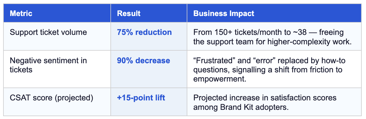
Brand-related support tickets dropped 75%. Negative user sentiment fell 90%. A 15-point CSAT lift is projected among Brand Kit adopters. All of it came from one reframe: stop treating brand as something users configure, and start treating it as the context they build within.

Timeline:

Q4 2024 – Q1 2025

Role:

Senior Product Designer

The Problem

The Problem

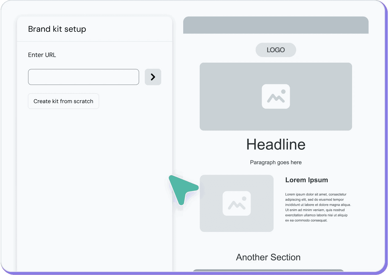
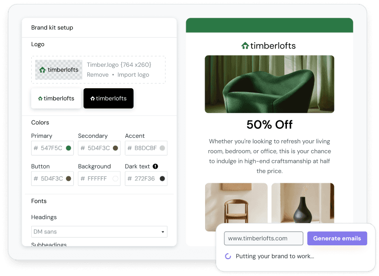
Mailjet’s original Brand Kit was powered by Clearbit. Users dropped in a company URL, the system detected colors and fonts, and generated a small set of branded templates. Useful as a starting point — but the moment you closed that flow, your brand was gone. There was nowhere for it to live.

Every new campaign was a blank slate. The result was a predictable pattern of failure:

  • Branding had to be manually reapplied to each template

  • Visual output drifted off-brand over time

  • Duplicated campaigns silently diverged from brand standards

  • Teams lacked confidence in how styles were inherited

  • Preview and inbox rendering mismatches eroded trust

Over 150 brand-related support tickets landed every month in H1 2025. The most common complaints fell into three categories:

  • Inconsistent branding: “Why are my brand colors not showing up correctly in the email editor?”

  • Manual errors: “I keep having to manually replace our old logo on every single template.”

  • Platform confusion: “My brand registration was rejected, and I have no idea why. I’m stuck.”

The frustration in those tickets was palpable:

“I need a way to create a colour palette and be able to access it throughout the campaign creation process—it is unbearably frustrating to have to input hex codes every time I go into a new content block.” — SEI York Comms Team

“Honestly, editing templates WYSIWYG-style may be cool for some, but power users are in pain. Having to copy-paste my general layout across templates is tedious.” — Fabien

“I can make themes by adjusting font presets, but how do I maintain themes across templates?” — Sebastian

This reinforced the need to treat Brand Kit as ambient infrastructure rather than a per-template configuration. These complaints pointed to a deeper issue: users couldn’t see or predict how brand rules were applied. There was no system — just manual work, repeated endlessly.

Our generic and dated template gallery

My Role

My Role

I owned Brand Kit end-to-end — from strategy and systems design through to the fine-grained interaction details across every surface it touched.

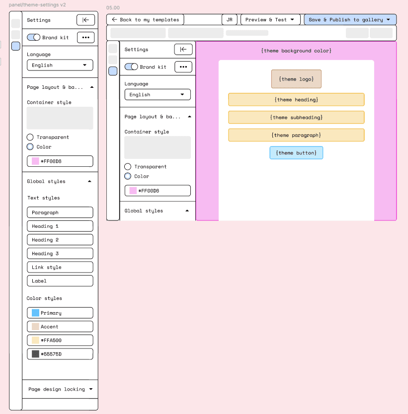
  • Defined the governance model for global vs. local brand behavior, with clear inheritance and override rules that made system state visible and predictable

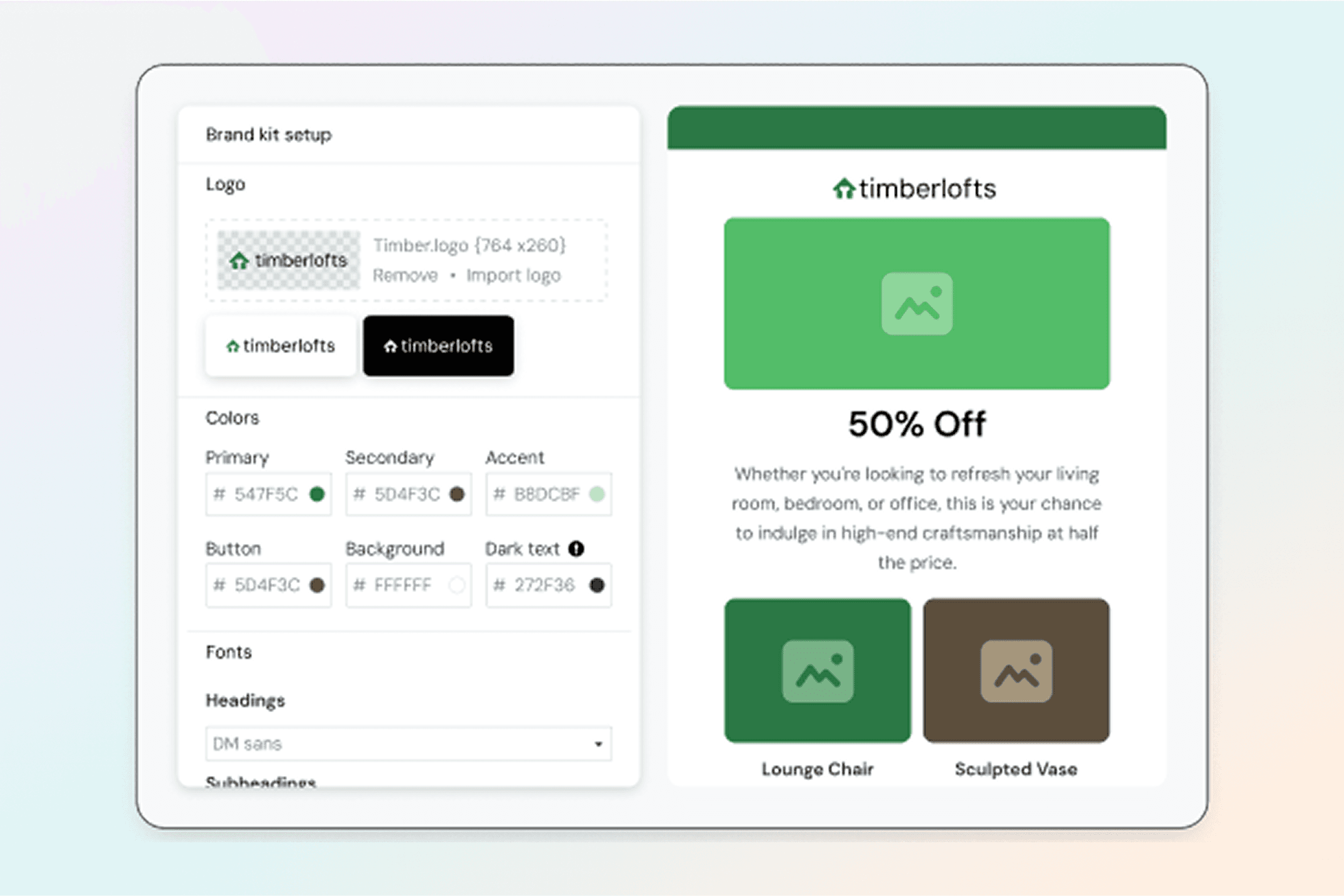
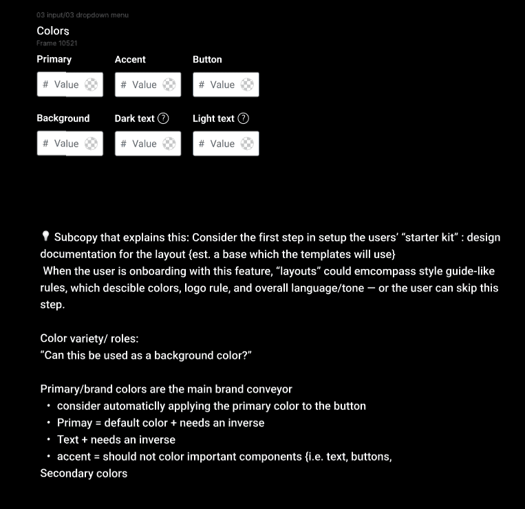
  • Designed a token-based color and typography system for scalable theming and graceful fallbacks

  • Led UX for onboarding, empty states, and progressive disclosure for both new and power users

  • Designed logo and social component behavior with consistent downstream rendering

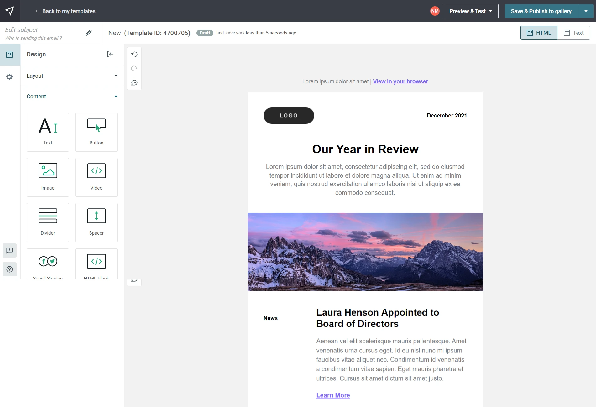
  • Integrated Brand Kit across the full editor ecosystem: email, landing page, form, and MMS builders

  • Rooted every decision in editor NPS and support data — solving root causes, not symptoms

Design Strategy

Design Strategy

Research across editor NPS, customer interviews, and support data kept surfacing the same thing: friction wasn’t really about Brand Kit settings. It showed up most painfully when users worked with templates, reused sections, or collaborated across teams — moments where the system’s invisible rules left them guessing.

The real question wasn’t “how do we improve the Brand Kit page?” It was: “how do we make brand feel active and ambient across everything users build?” That question led to the reframe that shaped the whole project:

THE REFRAME: When a user has a Brand Kit, it should feel active by default.

Branding isn’t a feature to enable — it’s the context users build within. This single principle changed the shape of every subsequent decision: what to store, how inheritance should work, where overrides should live, and how the system communicates its state.

Three principles that followed

  • Persistence over generation — brand assets stored as durable system state, not generated once and discarded

  • Global defaults with visible overrides — brand applied automatically, with clear affordances for intentional divergence

  • Predictable inheritance — styling scope made explicit so users can understand and trust how changes propagate

The Solution

The Solution

The redesigned Brand Kit stores colors, typography, and logos as persistent tokens — and applies them globally by default across every builder surface. No more re-entering hex codes. No more manual logo swaps. Brand just travels with your work.

The solution was built on three core principles:

1. Flexibility: Empowered users to define primary and secondary color palettes, logos, and fonts, allowing for creative variation while maintaining brand integrity

2. Automation: Once configured, the Brand Kit automatically applies the correct branding to all templates and campaigns, eliminating manual overrides and reducing the risk of human error

3. Consistency: By enforcing brand guidelines at the platform level, every piece of content created is perfectly on-brand — reinforcing a consistent and professional image for users

One place for everything

Primary and secondary palettes, typography pairings, logo variants — all defined once, all propagating automatically to every template and campaign. The moment a user sets up their Brand Kit, it becomes the foundation everything else is built on.

Global defaults, intentional overrides

Brand styles apply at the system level by default. When a user genuinely needs to diverge — a campaign with a distinct visual treatment, say — overrides are available, clearly surfaced, and easily reversible. Drift becomes a choice, not an accident.

Making the invisible visible

The trickiest design challenge was legibility: users needed to know, at a glance, which styles were coming from Brand Kit and which had been locally changed. Explicit visual signaling and override indicators directly addressed the “invisible system state” that had driven so much of the original frustration.

A foundation, not just a feature

Brand Kit became a dependency for three other major initiatives: editor modernization, AI-generated template quality, and enterprise multi-team workflows. Solving brand infrastructure at the system level unlocked consistent behavior everywhere — Emails, Landing Pages, Forms, MMS.

One place for everything

Primary and secondary palettes, typography pairings, logo variants — all defined once, all propagating automatically to every template and campaign. The moment a user sets up their Brand Kit, it becomes the foundation everything else is built on.

The redesigned Brand Kit stores colors, typography, and logos as persistent tokens — and applies them globally by default across every builder surface. No more re-entering hex codes. No more manual logo swaps. Brand just travels with your work.

The solution was built on three core principles:

1. Flexibility: Empowered users to define primary and secondary color palettes, logos, and fonts, allowing for creative variation while maintaining brand integrity

2. Automation: Once configured, the Brand Kit automatically applies the correct branding to all templates and campaigns, eliminating manual overrides and reducing the risk of human error

3. Consistency: By enforcing brand guidelines at the platform level, every piece of content created is perfectly on-brand — reinforcing a consistent and professional image for users

One place for everything

Primary and secondary palettes, typography pairings, logo variants — all defined once, all propagating automatically to every template and campaign. The moment a user sets up their Brand Kit, it becomes the foundation everything else is built on.

Global defaults, intentional overrides

Brand styles apply at the system level by default. When a user genuinely needs to diverge — a campaign with a distinct visual treatment, say — overrides are available, clearly surfaced, and easily reversible. Drift becomes a choice, not an accident.

Making the invisible visible

The trickiest design challenge was legibility: users needed to know, at a glance, which styles were coming from Brand Kit and which had been locally changed. Explicit visual signaling and override indicators directly addressed the “invisible system state” that had driven so much of the original frustration.

A foundation, not just a feature

Brand Kit became a dependency for three other major initiatives: editor modernization, AI-generated template quality, and enterprise multi-team workflows. Solving brand infrastructure at the system level unlocked consistent behavior everywhere — Emails, Landing Pages, Forms, MMS.

Global defaults, intentional overrides

Brand styles apply at the system level by default. When a user genuinely needs to diverge — a campaign with a distinct visual treatment, say — overrides are available, clearly surfaced, and easily reversible. Drift becomes a choice, not an accident.

The redesigned Brand Kit stores colors, typography, and logos as persistent tokens — and applies them globally by default across every builder surface. No more re-entering hex codes. No more manual logo swaps. Brand just travels with your work.

The solution was built on three core principles:

1. Flexibility: Empowered users to define primary and secondary color palettes, logos, and fonts, allowing for creative variation while maintaining brand integrity

2. Automation: Once configured, the Brand Kit automatically applies the correct branding to all templates and campaigns, eliminating manual overrides and reducing the risk of human error

3. Consistency: By enforcing brand guidelines at the platform level, every piece of content created is perfectly on-brand — reinforcing a consistent and professional image for users

One place for everything

Primary and secondary palettes, typography pairings, logo variants — all defined once, all propagating automatically to every template and campaign. The moment a user sets up their Brand Kit, it becomes the foundation everything else is built on.

Global defaults, intentional overrides

Brand styles apply at the system level by default. When a user genuinely needs to diverge — a campaign with a distinct visual treatment, say — overrides are available, clearly surfaced, and easily reversible. Drift becomes a choice, not an accident.

Making the invisible visible

The trickiest design challenge was legibility: users needed to know, at a glance, which styles were coming from Brand Kit and which had been locally changed. Explicit visual signaling and override indicators directly addressed the “invisible system state” that had driven so much of the original frustration.

A foundation, not just a feature

Brand Kit became a dependency for three other major initiatives: editor modernization, AI-generated template quality, and enterprise multi-team workflows. Solving brand infrastructure at the system level unlocked consistent behavior everywhere — Emails, Landing Pages, Forms, MMS.

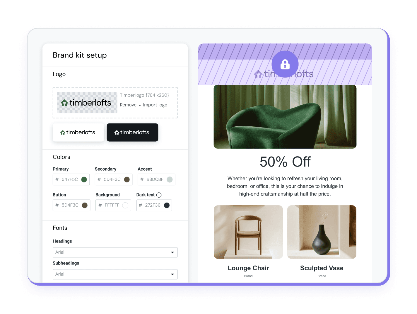
[Asset — Override badge (must-have)] Block labeled “Overrides brand” with revert action.

Making the invisible visible

The trickiest design challenge was legibility: users needed to know, at a glance, which styles were coming from Brand Kit and which had been locally changed. Explicit visual signaling and override indicators directly addressed the “invisible system state” that had driven so much of the original frustration.

The redesigned Brand Kit stores colors, typography, and logos as persistent tokens — and applies them globally by default across every builder surface. No more re-entering hex codes. No more manual logo swaps. Brand just travels with your work.

The solution was built on three core principles:

1. Flexibility: Empowered users to define primary and secondary color palettes, logos, and fonts, allowing for creative variation while maintaining brand integrity

2. Automation: Once configured, the Brand Kit automatically applies the correct branding to all templates and campaigns, eliminating manual overrides and reducing the risk of human error

3. Consistency: By enforcing brand guidelines at the platform level, every piece of content created is perfectly on-brand — reinforcing a consistent and professional image for users

One place for everything

Primary and secondary palettes, typography pairings, logo variants — all defined once, all propagating automatically to every template and campaign. The moment a user sets up their Brand Kit, it becomes the foundation everything else is built on.

Global defaults, intentional overrides

Brand styles apply at the system level by default. When a user genuinely needs to diverge — a campaign with a distinct visual treatment, say — overrides are available, clearly surfaced, and easily reversible. Drift becomes a choice, not an accident.

Making the invisible visible

The trickiest design challenge was legibility: users needed to know, at a glance, which styles were coming from Brand Kit and which had been locally changed. Explicit visual signaling and override indicators directly addressed the “invisible system state” that had driven so much of the original frustration.

A foundation, not just a feature

Brand Kit became a dependency for three other major initiatives: editor modernization, AI-generated template quality, and enterprise multi-team workflows. Solving brand infrastructure at the system level unlocked consistent behavior everywhere — Emails, Landing Pages, Forms, MMS.

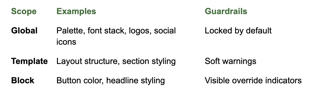
Governance model based on atomic principles

Key Considerations

Key Considerations

Logo Component

Standardized logo placement with consistent sizing, alignment, and retina support across templates.

[Asset — Logo component states (nice-to-have)]

Social Component

Centralized social links with brand-consistent icons and behaviors, removing duplication across campaigns.

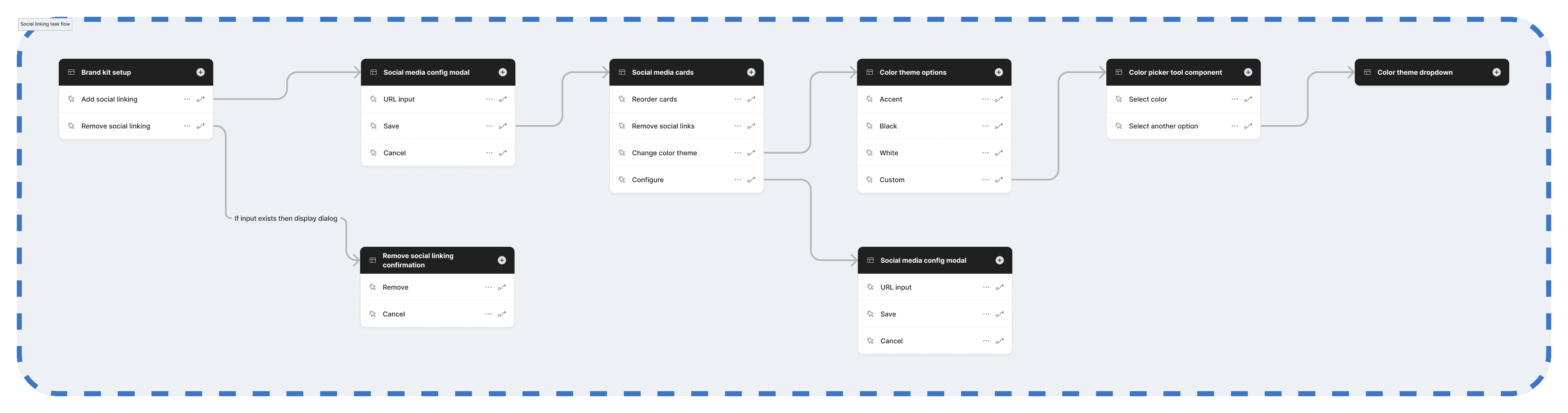
Social setup task flow

Brand Onboarding & Empty States

Sample palettes, guidance copy, and nudges help users succeed even without prepared assets.

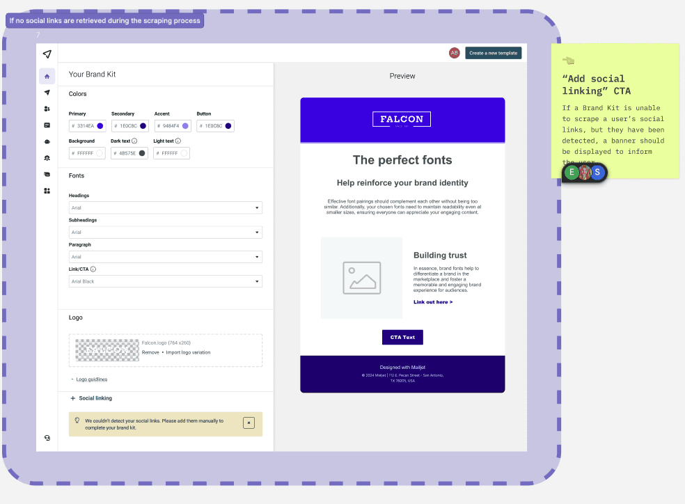
[Asset — Social setup panel (nice-to-have)]

Non-Blocking Defaults

When no Brand Kit exists, builders fall back to neutral, accessible defaults that preserve usability without forcing setup—allowing users to explore and create confidently before committing to brand configuration.

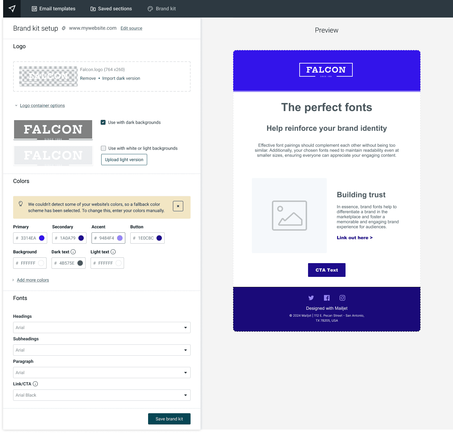
💡 Fallback color scheme based on Mailjet colors

Outcomes

Outcomes

The quarter after launch told a clear story:

Reduced support load and improved sentiment

The most dramatic impact was the 75% reduction in support tickets — dropping from over 150 per month to an average of just 38 in the quarter following launch. Furthermore, the nature of the tickets shifted. Instead of bug reports and complaints, inquiries became primarily how-to questions, indicating users were successfully engaging with the feature rather than fighting it.

An analysis of the language in support tickets shows a 90% decrease in negative keywords like “error” and “frustrated,” replaced by positive sentiment and questions focused on expanding usage — “How can I add a secondary brand?” This shift from frustration to empowerment is a clear indicator of a vastly improved user experience.

Faster time-to-publish and increased efficiency

While direct time-to-publish data was still being analyzed by the OneSaaS Data Analytics team, the reduction in support tickets and the shift in user sentiment strongly suggest that users are spending less time fighting the editor and more time creating content. The automation of color, font, and logo application directly addresses the primary efficiency bottlenecks users had flagged — and the support data makes the story obvious: users got their time back.

Measurably better brand consistency

With Brand Kit as live infrastructure, visual identity stays consistent across all communications — no more silent drift, no more rework, no more second-guessing whether a duplicated campaign is still on-brand. Widespread adoption is ensuring that the visual identity of users’ brands remains consistent across every piece of content they create.

Status: Core Brand Kit functionality is live. The governance patterns shown represent defined, research-baked concepts that have been handed off for implementation and are planned alongside broader editor and AI improvements.

Strategic Impact

Strategic Impact

Brand Kit touches every single campaign a user creates — which makes it a high-leverage system. But the bigger win was what it unlocked downstream.

By making brand infrastructure explicit and trustworthy at the system level, we gave editor modernization a stable foundation to build on. It also became essential for AI-assisted template generation — without reliable brand context, AI outputs have no visual frame of reference to work from. And for enterprise teams, it enabled the kind of multi-brand governance that had previously been impossible.

Dropping from 150+ support tickets a month to ~38 also freed up the support team in a meaningful way — and it made a compelling case internally that investing in design infrastructure pays back more than piecemeal feature work. This demonstrates the power of data-driven, user-centered design to solve critical pain points and deliver tangible business value.

Measured across support trends, sentiment analysis, and early post-launch validation.

Negative Brand-Related Mentions: 100 mentions → 10 mentions (-90%)

Successful Campaign Creation (Average): 50% → 85% (+35 pts)

Reflections

Reflections

The most important decision in this project wasn’t a UI pattern. It was the reframe. Once I stopped asking “how do we improve the settings page?” and started asking “how do we make brand ambient?”, every subsequent decision got easier and more coherent.

I’ve found that when user feedback is consistent and structural — when different people, in different contexts, keep bumping into the same wall — the answer is almost always structural too. Patching individual pain points would have helped temporarily. Building the system fixed it.

That’s the lesson I carry into complex design problems: move upstream. The most impactful work usually lives one level above where the frustration surfaces.

Enter password to view case study